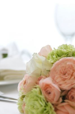
 Bringing your wedding to life takes a combination of planning, creativity, collaboration and funds allocation. While not every couple chooses a theme, most pick their attire and décor using a palette of two or three colors. The season in which you two will wed, along with your venues and any cultural traditions you share, may shape your final chromatic choices. If you’re not sure how to get started, try these tips to craft a delightfully hued aesthetic for your special day.
Remember Your Venue’s Colors
Before you design the look and feel of your event, it’s a good idea to assess your venues’ existing décor. Ignoring it could create awful clashing between your colors and those used by your sites, resulting in a non-cohesive appearance. Unless you want a purposeful discordant visual effect, Brides columnist Elizabeth Mitchell suggests selecting shades that go well with your sites’ existing scheme.
When Are You Getting Married?
Taking your color cues from the season can also be a wise move. Spring, summer, autumn and winter all have endless possible combinations for your celebration. Bridal Guide contributor David Tutera advises opting for left-of-center seasonal palettes that aren’t too predictable. Tutera mentions fall as an example, commenting that brown and orange for a fall ceremony might feel “overdone” and “typical” while burgundy and copper with a hint of lavender can be unexpected and refreshing. However, keep in mind that these aren’t hard and fast rules and that you don’t have to stick to season-specific shades.
Pick Two to Three Shades
To make décor and apparel choices easier, Mitchell recommends sticking to a palette of no more than three colors. Meanwhile, some experts such as A Practical Wedding’s Meg Keene push the envelope, proposing that you can safely include up to four pigments. Depending on your preferences, Keene explains that one or two can serve as the primary hues in your collection while the others become your accent shades. When making your choices, consider the mood you wish to evoke. Bold, high-energy options can be lively and energizing while subtler shades can tone things down for a more relaxed, casual vibe.
Of course, you want your selections to harmonize with each other in some fashion. Wedding Wire writer Alex Reardon briefly describes how you can use the color wheel as your inspiration:
- Complementary pigments, such as blue and orange, exist opposite each other on the wheel
- Analogous shades, like blue and violet, lie next to each other
- Monochromatic colors, such as gold and citrine, are variations of the same tone
You can craft your own unique wedding look with an approach that combines the color wheel with seasonal or other inspirations. An easy example is picking a plum tone for your primary hue, then harmonizing it with a complementary gold shade. Navy is one possible option for a third color, as it's near on the wheel to your plum, or you could go with an orange tone that’s adjacent to your gold shade. With this method, the possibilities are endless.
Go With What You Love
You might have scoured Pinterest for ideas, or have found suggestions such as The Knot contributor Andrea Fowler’s collection of offbeat palettes. Fashion-forward, intrepid couples might use these for inspiration. If you’re not so adventurous or don’t adore the latest trends, Mitchell assures you that it’s safe to stick with colors you personally love. She also advises avoiding shades not found in nature, such as neon pink.
Designing your wedding’s aesthetics can be a fun adventure. With a few useful tips under your belt, picking your palette becomes easier than you might think. Guided by the color wheel, your venues’ décor scheme, the seasons and other inspirations, your special day will be crafted in stunning, living color.
Add Your Comment