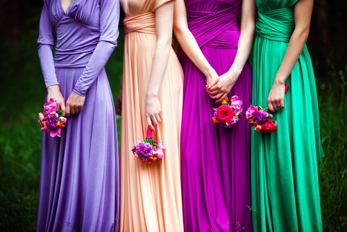
 Color plays a huge role in how your wedding looks and feels. When working with your vendors, speaking a common “color language” can help communicate your ideas. We all perceive the world a little differently, and that affects how we visualize — or if we can even see — specific shades. This quick guide to color systems can help you better choose your hues and express your wedding-day vision to your florist, baker, and other professionals.
The Science of Color
Color comes from electromagnetic radiation, or radiant energy that exists as either continuous electromagnetic waves or extremely small energy packets called photons. Electromagnetic radiation comes in many forms: radio, gamma, light, ultraviolet, and X-rays, to name a few.
Wavelengths in the visible light spectrum take on different spectral colors: red, orange, yellow, green, cyan, blue, and violet. Red has the longest wavelengths, and violet has the shortest. We perceive these colors because our eyes’ photoreceptor cells translate light into signals that our brains can process. Most of us have three types of color-specific photoreceptors called “cones” in our retinas: red, green, and blue.
Culture, Language, and Color Perception
Now that we know what produces color, we need to understand how humans classify it. Our cultures impact how we perceive and speak about color. The Korean word “pureu-da” can refer to blue or green, but nouns are added to clarify the context: a blue sky versus a green forest. Telugu, a Dravidian language of India, uses the same word for green and yellow, “pacca.” Speakers prefix nouns to indicate a specific shade.
These examples underscore an important point: We often use objects in our environments to describe color. Try describing “arrest me red” to people from a rural tribal society. Similarly, you won’t know what a Telugu speaker means by “pasupupacca” or “turmeric-pacca” if you’ve never seen turmeric.
How Can We Describe Color?
Several color systems exist, each designed for specific purposes. Neglia Design describes the four most used schemas: PMS, CMYK, RGB, and HEX. RGB and HEX are additive systems used for on-screen colors, while PMS and CMYK are subtractive systems used for colors in print.
Subtractive systems filter color wavelengths through complementary shades; cyan filters red, magenta filters green, and yellow filters blue. The “K” in CMYK refers to black ink, which removes undesirable tints and improves image sharpness. Pantone uses proprietary inks in offset printing, but it’s expanded its color system to include shades for textiles, plastics, and interior décor.
Additive systems create color by adding different proportions of red, green, and blue. RGB is a widely used digital standard, and its cousin HEX is mostly used in web design. RGB uses three numbers to specify how much red, green, and blue should be mixed for each color. HEX works in almost the same way, except it “speaks” color in unique six-digit hexadecimal numbers.
Speaking Color to Your Wedding Professionals
Once you’ve picked a great-looking color palette with your desired style and mood, how do you communicate it to your vendors? Pantone’s color-finder is a good place to find the exact hues you want; you can even grab Pantone’s color numbers for your shades, which can help pros working with printing and textiles. Wedding Wire’s palette tool guides you through palette selection. DIY-type folks may want to try BeFunky’s Graphic Designer for mood boards with color swatches or Colour Lovers’ create a palette tool. You can digitally share your boards and palettes with your pros during the planning stages.
Color is both a science and an art, but how we classify shades is subjective. Finding a common color language, using digital color selection tools, and sharing your inspirations can help you and your wedding pros get on the same page in bringing your vision to life.
Add Your Comment